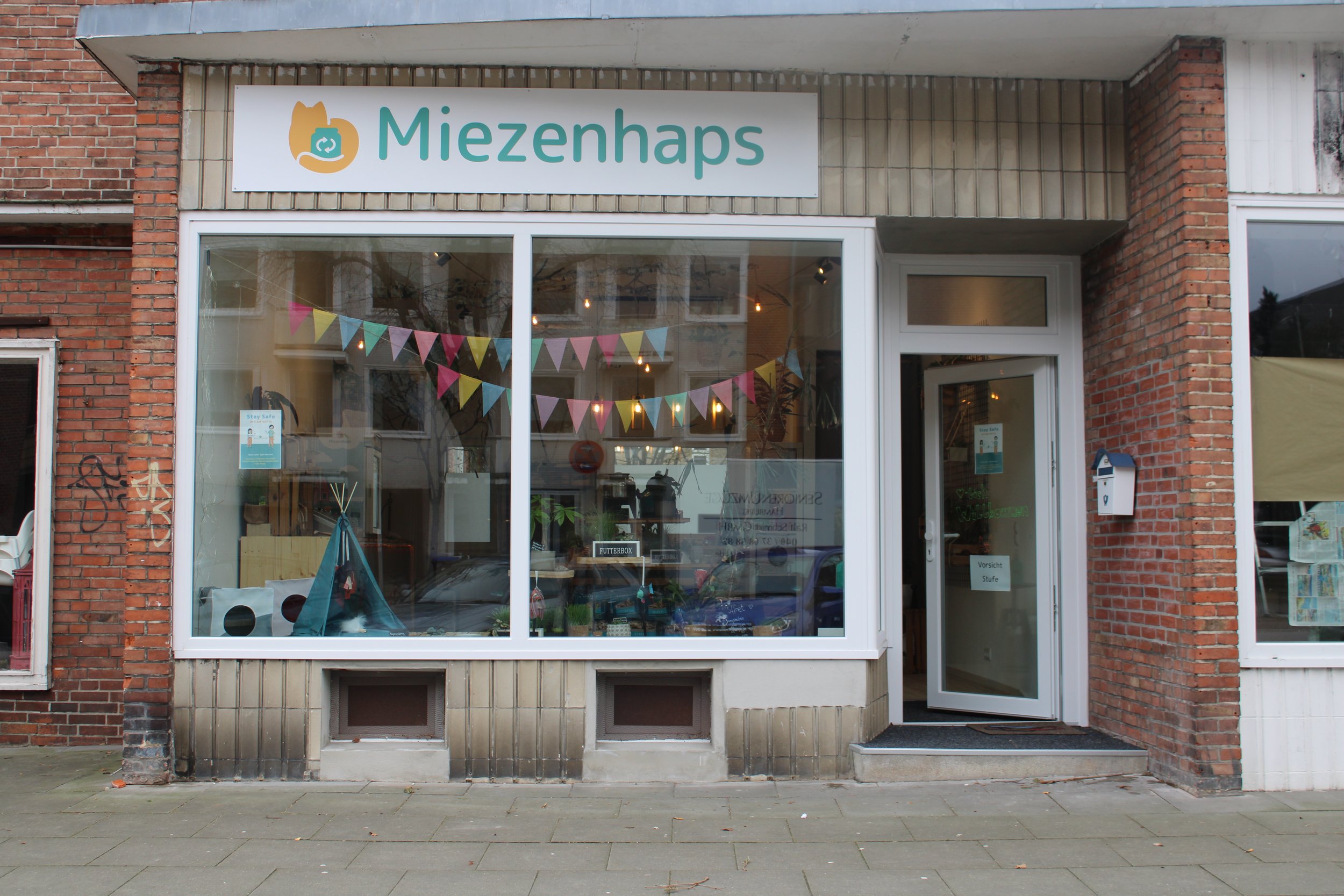
Miezenhaps
Miezenhaps started as a barf cat food service offering raw bio meat with organic and regional produce for cats. The owner and founder Jessica Jungmann is a nutritionist with a special focus on cat nutrition. On every Miezenhaps product, there is a focus placed on regionality, sustainability and climate protection.
Later on she decided to open a cat shop in Hamburg. Her company would not only focus on cat food, but would become a cat shop as well. She was in need of a new brand identity that would make her stand out in the eco-friendly and sustainable small businesses for pets.
Miezenhaps Brand and Shop
Her shop is focused on only selling products that are sustainable, local made, good for the environment and supporting small businesses. Once she opened her shop, she needed to have a new branding for her company. I designed my client’s logo and brand identity, which has been a passion project for me since I love animals and pets in general.
I was very happy to have been offered the challenge to create Miezenhaps brand identity.
The Project started with proposing concepts and sketches for different directions (see logo process on images above).
Once Jessica chose a concept, I decided to start some digital drafts just to show some direction and let my client choose the proceeding visual direction it would take. I like to have my clients onboard on every step of the logo process.
After the concept and visual direction was chosen, I embarked into illustrating and developing the isotype so it can represent her brand. Her focus is sustainability and the importance of reusing materials like jars for her cat food subscription service. She wanted to keep the recycle symbol in her logo. I proposed the gesture of a tabby cat hugging the jar as a gesture of love and care. Her food is all about giving the cats the best care to keeping them happy and healthy. I wanted to reflect that as well as the sustainability aspect.
After the isotype was developed, the last steps were developing options for a color palette for her brand as well as the typography that would fit the look & feel we were aiming for.
It was a pleasure to have developed her brand and styleguide for her identity.
I also designed and illustrated the cat food labels and the graphics for the mini fridge (see from images below), where she keeps her fresh cat food produce.
I enjoyed this challenge very much and client was happy with the results. I was delighted to have been part of this and have helped Jessica to have a brand that represents her sustainable approach and reach her target audience with ease.


